Finally, to close this topic here's a little experiment.
When powers or magic are involved, you will often face
the issue of having to overlay some FX material on characters although their UVs
were not designed for it. What you want is your Fx UVs to be independent
from the textured model's.
You
could animate your material in screen space. That's not too bad an option but
that'll be visible as the camera and the animated models move.
You
could create a second UVs set with cylindrical UV mapping. This is the
method I used on the doppelganger model in DmC 5 DLC: Vergil Downfall.
That comes at a cost (that of an extra UVS set) and depending on the shape of your model, you can experience some stretching in certain areas.
(It was mostly ok on that slim character but still not fully satisfying).
Another
method would be to have a material that is not UV dependant but
that would still move with the object.
I can't
guarantee this is production worthy, I only made it for fun. It might be too expensive to actually be usable but I
still like the idea.
This is a capture of the first test I made… wow, almost two years ago already.
I'll recreate something similar now. (I wish I had saved my packages at the time.)
We'll start it simple and gradually add layers of complexity.
pointing towards z. We'll check which direction the vertices are facing. Those that face z return a value of 1, the others of 0. (Sure, that's a bit simplified but it's ok for now since we're working with a cube.)
White and black? Yay we got ourselves a mask. We just need to multiply this with our remapped texture.
(Note that we use a scalar parameter to adjust the size, not just a
constant. You'll use that same parameter on each axis so that the sizes
are consistent. Besides, when comes the time for actually texturing an object
it's better to adjust your values within a material instance than editing your original material.)
The value of the normal is -1 on the bottom. We use the
abs node to make negative values absolute (that is to say, positive) and now we see both the top and bottom of the cube.
- We duplicate the above set up 3 times and tick the correct channels to appropriately map along x, y and z and then we add everything together. We can safely do so with nothing overlapping since we've only retained what's happening along a single axis every time.
Mis-ticking a box is easy. To double check that a section of material is fine you can right clic any node and go ‘Start previewing node’. Saves you the hassle of having to temporarily plug that bit in your output.
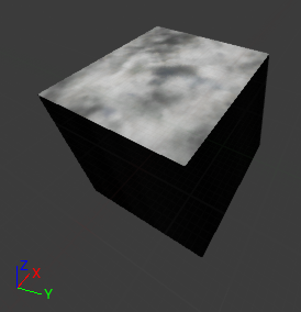
- Here we go. We've got all our faces textured.
It doesn't look like much so far, because it's only a cube but if you move it around you can see how the texture sort of belongs to the world. We're not using the UVs space so we could texture any object, not just a cube.
Like this chair for instance:
Making the material local.
If you want the object to be animated, it's not good to see it move through the texture. We'll make it local, as we did
before.
Separating positive and negative axis.
We've got the basics in place. Now we want this material to look a bit more interesting.
We'll start by panning our texture.
Right now, the positive and negative axis display the same thing. Since we are pretending this is happening in space we need to invert the panning direction in positive and negative for the texture to appear to rotate around the object.
In order to get the positive and negative both white and the rest black, we've just made the vertex normal
absolute. Now we're going to use a
ceil node so that the positive axis is white and the rest is black. Then we can use the output as a mask.
When I want to check whether my connections are right, I often use a
lerp with obvious colours. I might have mentioned this before, I'm not sure.
With this we can double check that +x is green while rest is red (even the back, I promise you). We're good to go.
- Here's the whole thing with the inverted panners in x and the ceiled result used as a mask to drive the linear interpolation:
Now, this works on a cube which normals conveniently face a single axis
but that's not good on a sphere for instance. The textures projected along different axis overlap because each vertex is not just facing x, y or z. It's a bit of each.
We're going to need to
modulate the transitions between our masks.
(Too many gifs, I'm dizzy. Oh, and by the way I'm changing to a more contrasted texture. I had picked a random one to start with.)
Transition between facing axis.
On a very smooth object such as a sphere, the normals are not going to get to a full 0 until they reach the next axis. That's why you can see the textures overlap.
Here is the preview of one single texture. In this case, you would want to see the texture on the sides, but not all the way to the front.
- We'll just add a power on what we use as a mask: after the abs on the vertex normals that is.
Power of 1 (same as no power):
Power of 5:
We replicate this for each axis, only this time we're renaming the parameter to have a different control for x, y and z. We'll need different adjustments per axis depending on our object.
Here's the result on a sphere. The x and y work ok, the z not so much because its panning speed can't match in every direction. We'll leave it as is for now.
Now I want to start making some actual art. To do so more easily I want to be able to control my parameters from a material instance. That material is too spread out to work from inside.
My problem is, I've got the texture's scale exposed but not its panning speed. I would like to be able to control the speed in x and y independently but I can't do so right now.
You see, both my x and y panning values are contained within the same panner. If I multiply time, both x and y will be affected the same. And I can't multiply time by a vector 2 constant because the panner expects a constant 1 time input. We'll need to make more changes to our material.
Controlling x and y panning speed from the material instance.
Here's a simple way of splitting both speeds:
Just link two panners in a row. The first one has a speed of x = 1, y = 0, the second one is x = 0 , y = 1.
Now for the complicated one.
Why so? Because I built it before I realised I had a very simple and easy option and I don't want my hard work wasted. Besides, as it turns it seems to be 2 instructions cheaper according to the material editor stats.
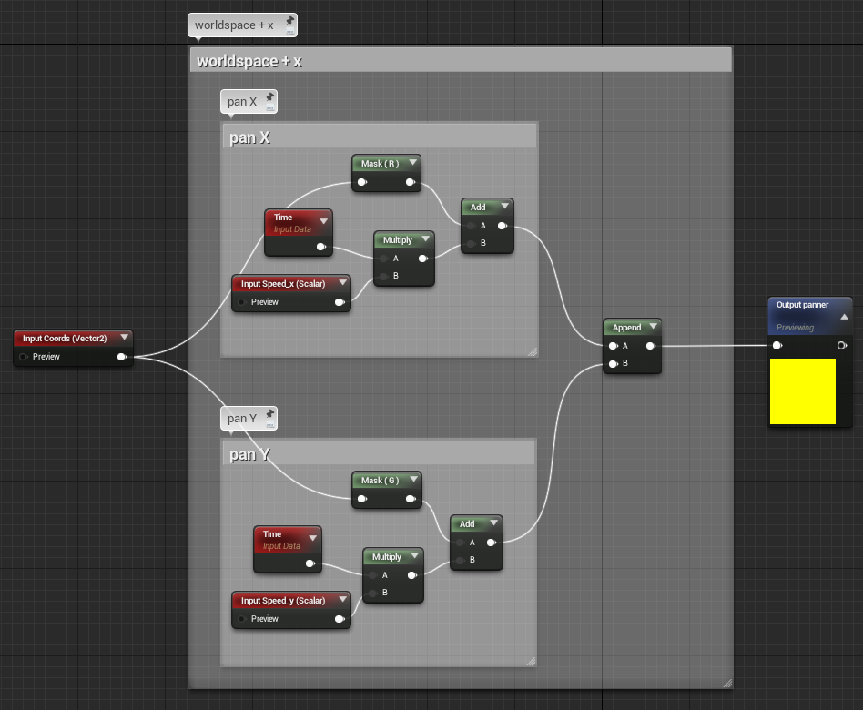
Basically, we'll recreate the functionality of a panner. Panning is adding a value to our coordinates to shift them over time. We'll just do that: add time to our coordinates.
In the following screenshot, the input coming from off screen on the left are the coordinates in world space. We filter them and keep only the x or y, and add time that is multiplied by a parameter to which we'll have access in the material instance. Easy enough.
The only problem is: it looks kinda messy. Well not messy but big. Way too big. We need controls over x and y for the vertices facing worldspace x and an inverted speed for the vertices facing worldspace -x. Even though we can reuse the block controlling the y speed it's still a lot of nodes.
And that's where some cool guys come into play:
Material functions.
We'll make a function out of this. A material function is a bunch of instructions you put together and nestle within a single node to keep things neat and easily propagate changes. You can use a material function in any given material.
I won't go in depth on how to make one, it's
all in the documentation, I don't think I'd have anything to add to it, but feel free to ask questions if you have any.
Here's my function:
I've got several exposed parameters; three inputs:
- texture coordinates
- speed x
- speed y
And a single output: that'll be the coordinates going through the panners.
Here's the function used twice to replace our groups of nodes. I didn't have to duplicate the ‘speed y’ parameter but I like to avoid connections crossing.
You see:
Much clearer isn't it?
Finally, here's the whole thing:
Arted example.
With the above screenshot you've got the basis to make the material work. Now I'll make an arted version but this will only be one of the possible outcomes. You could imagine doing anything you usually do with a texture to make this more interesting.
My advice would be: don't get too carried away because this thing can quickly scale up and get out of hands.
Before you go too far with this and add a lot of details, preview it in actual game conditions. If there's a lot of action / post processes / particles going on, if that material doesn't stay on for too long, if you don't have any slomo involved… well a simple version is probably enough. The patterns of a couple of moving textures can be spotted quite easily if you stare at them but perhaps a player won't be staring and it'll just be parts of his landscape. It really depends on the context of your game.
Looking back at my old video capture, I was probably multiplying an animated texture with a mask.
The choice I've made this time is to pan a texture and offset its UVs with two panning textures added together. Don't pay attention to the model itself, it's a default example model from zbrush.
The transitions are seamless, our previous issue with the z axis not matching is not visible so I basically ignored it and didn't try to fix it. (This means I can simplify the material and remove the bits about inverting the panning direction for the z axis by the way.)
You can see that this happens in world space, not in UV space since I can scale the model without the texture scaling along.
And with this, our topic is wrapped up at last !


